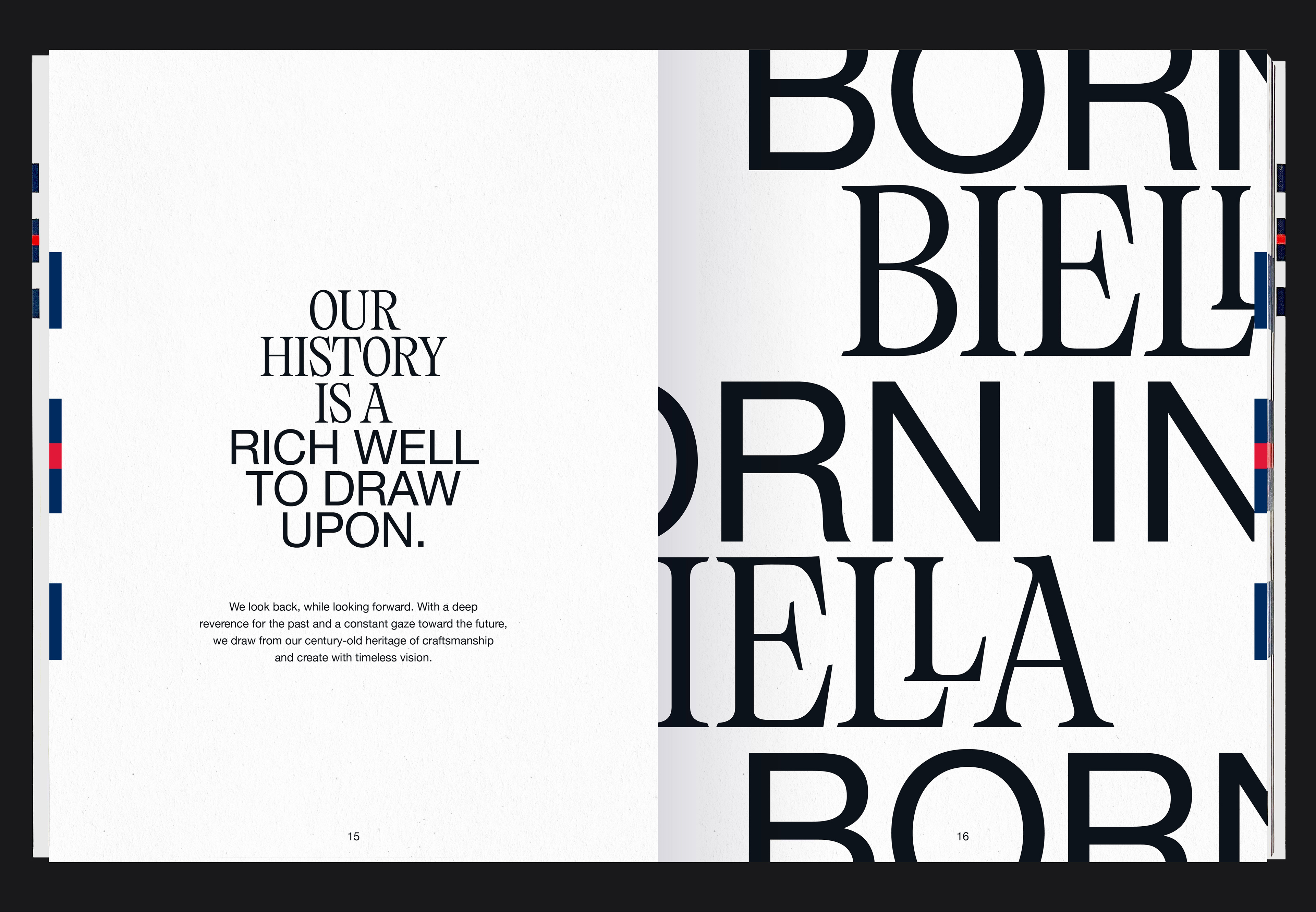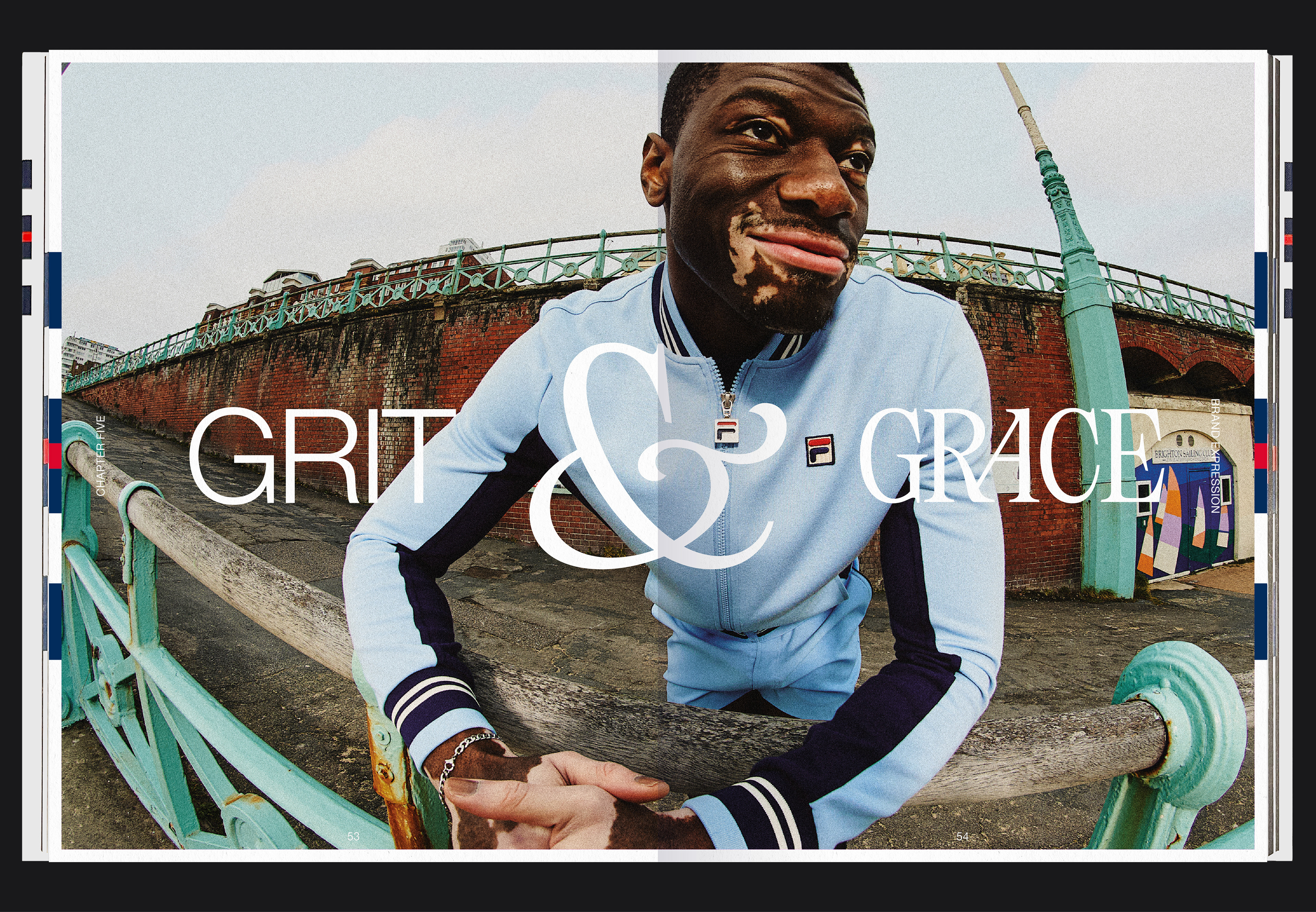


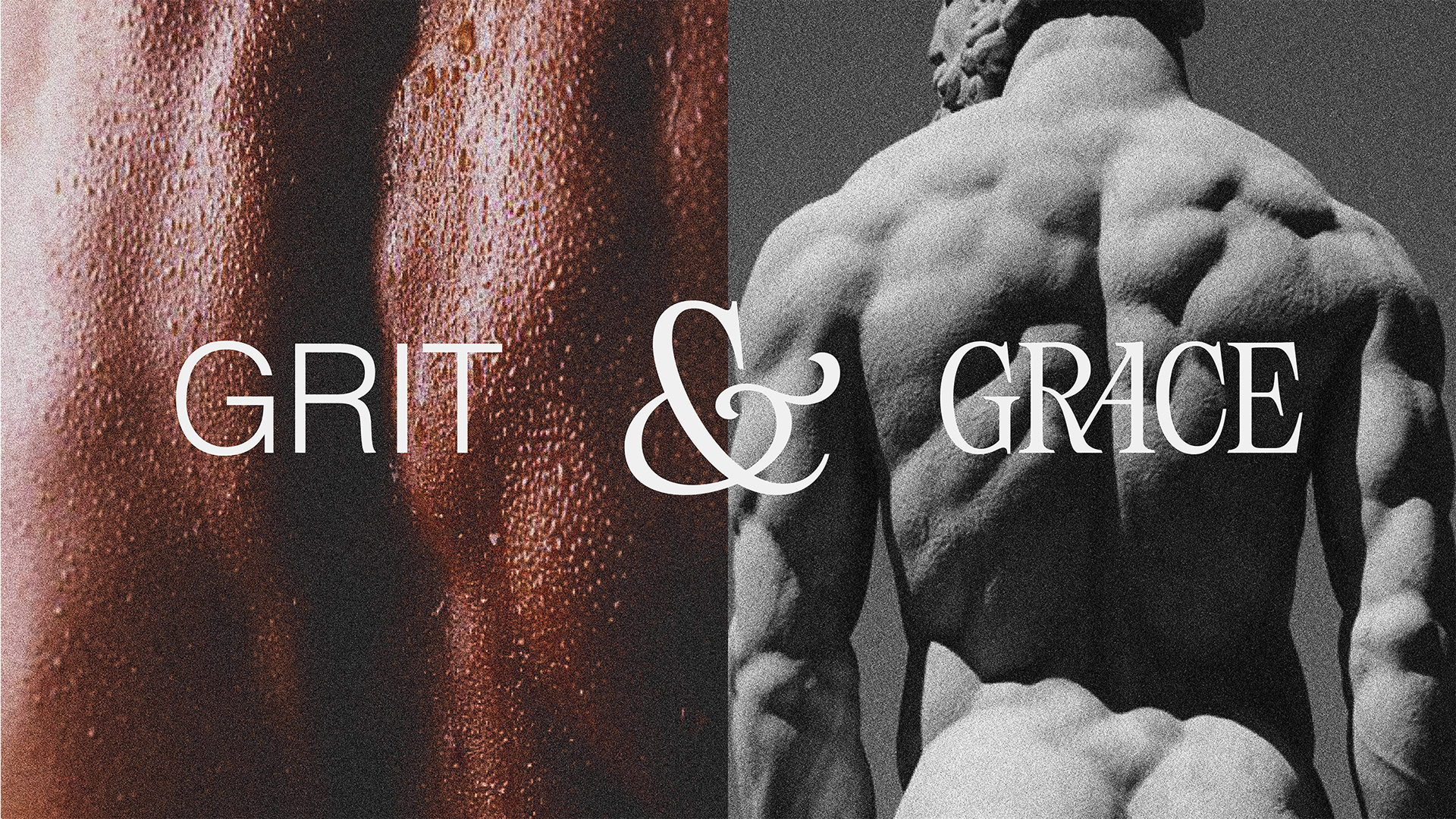
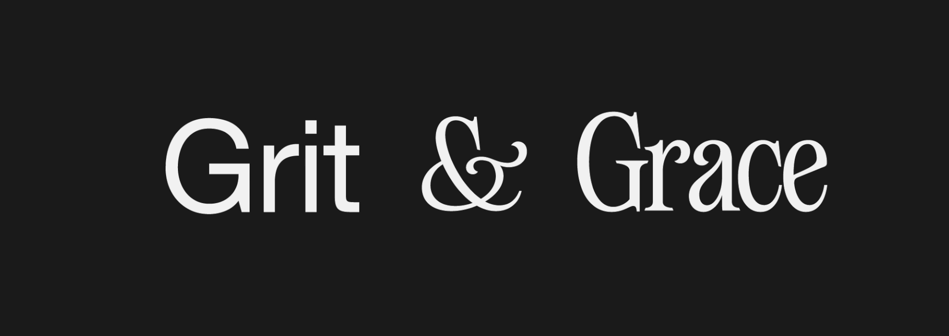
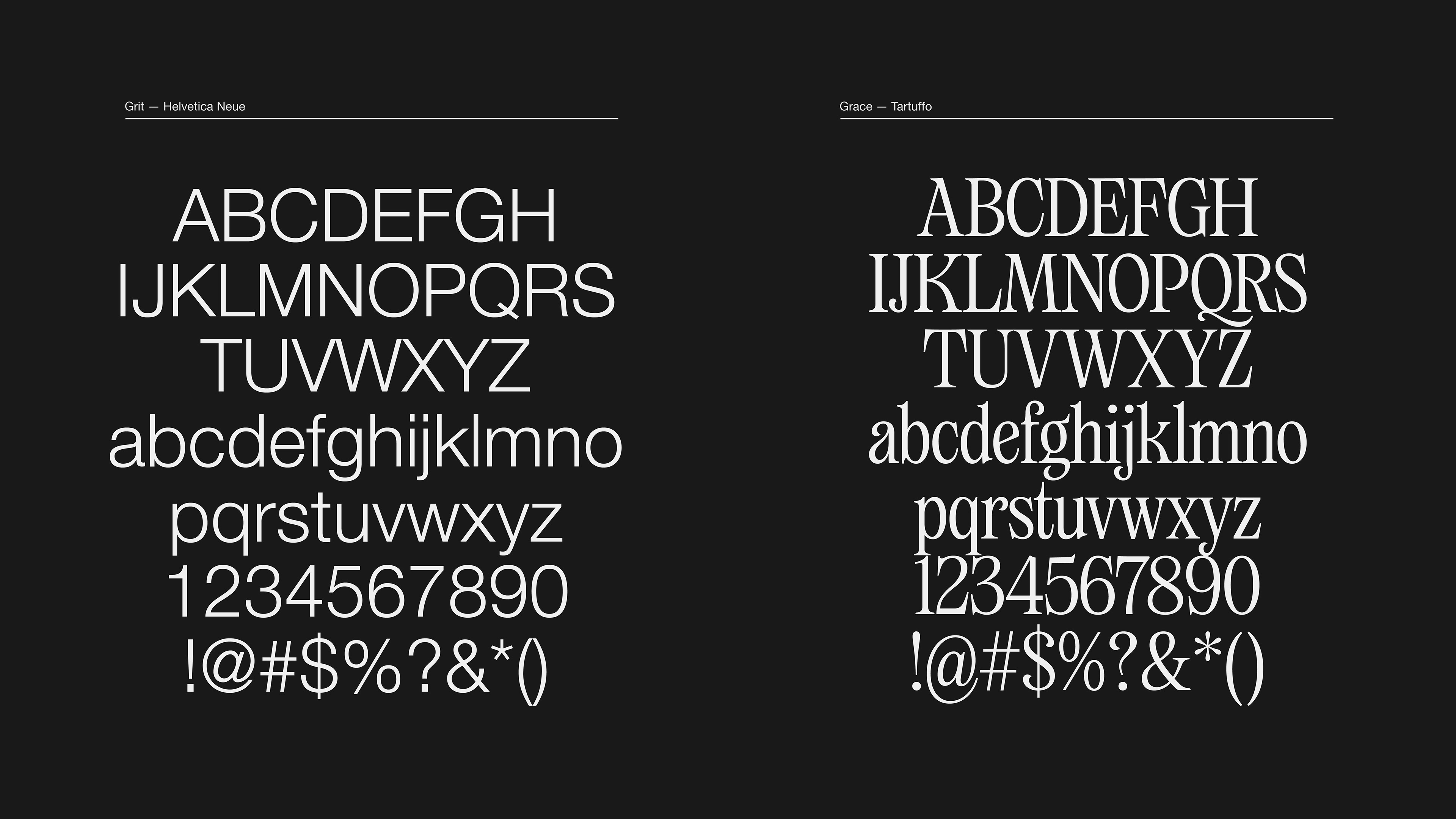
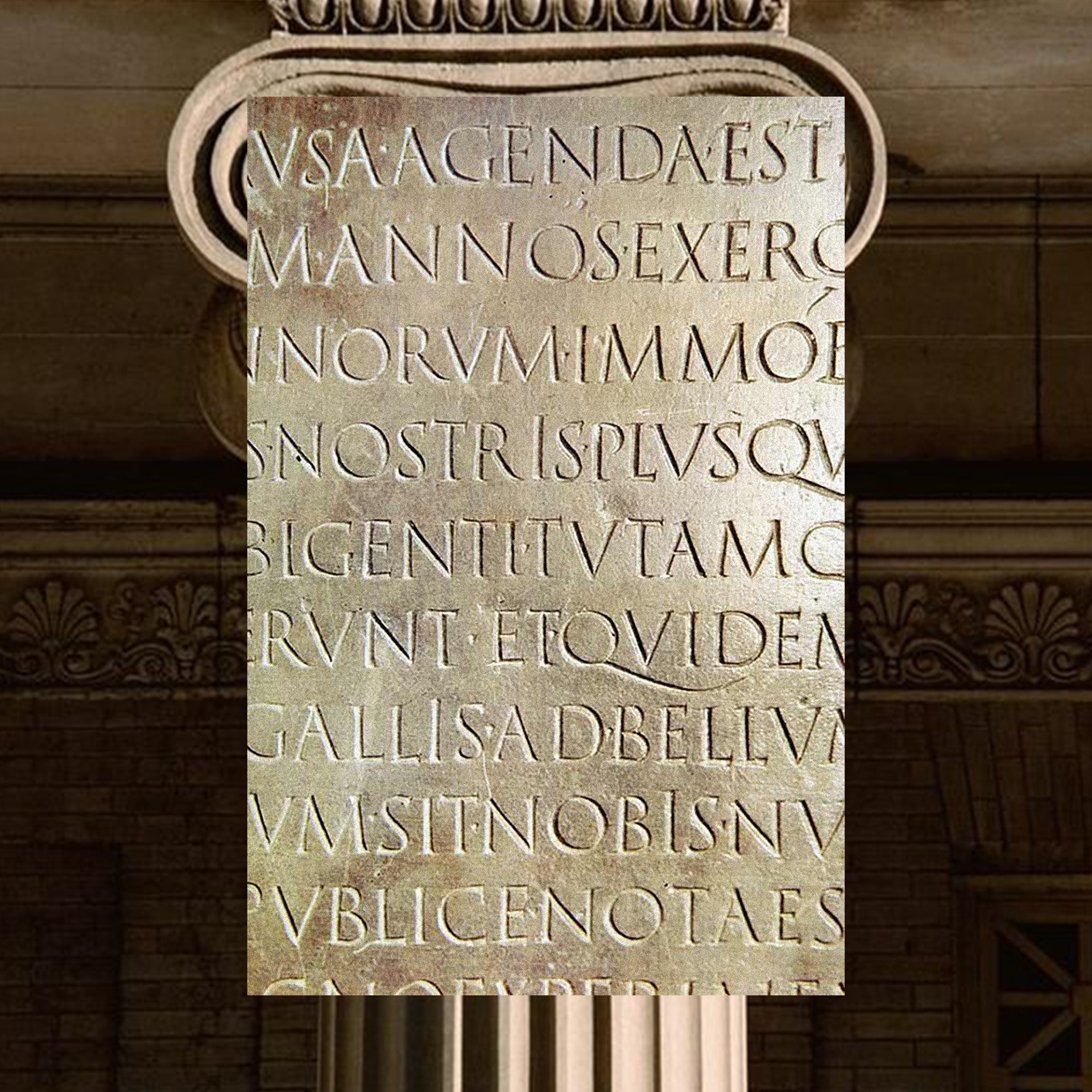
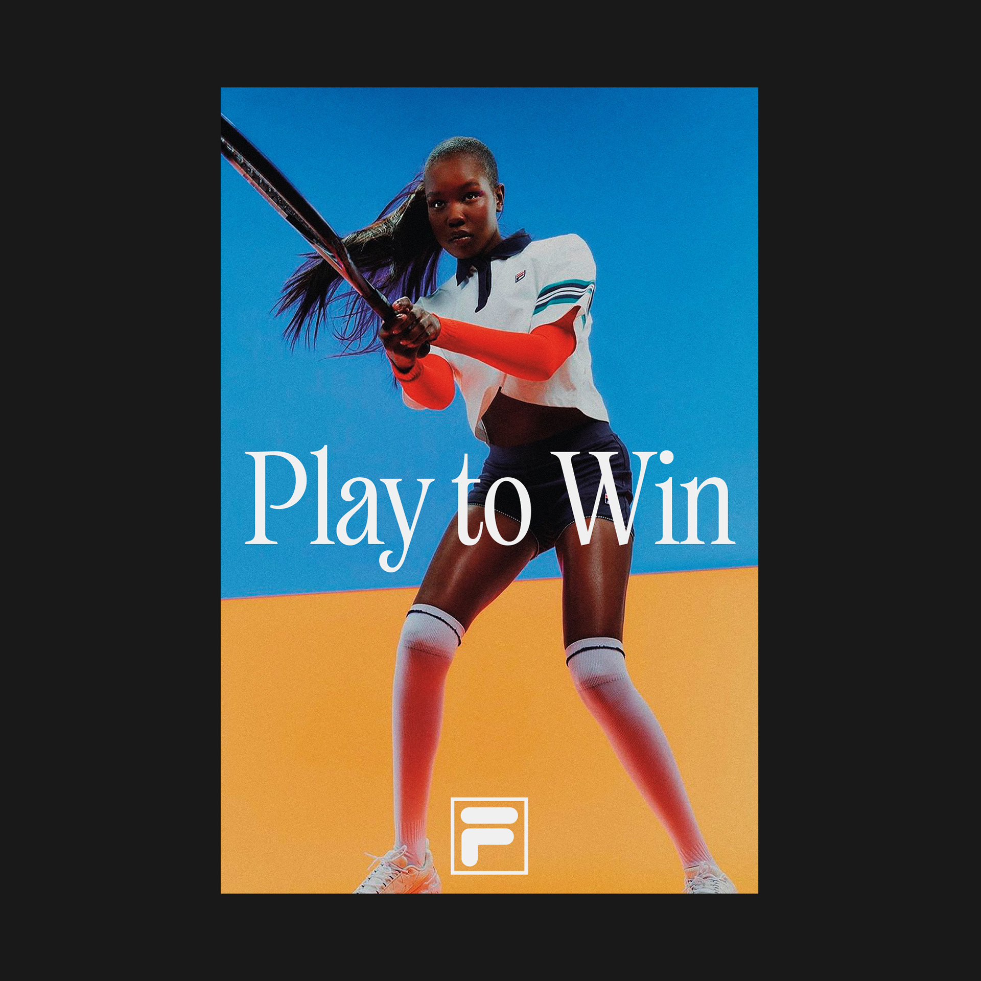
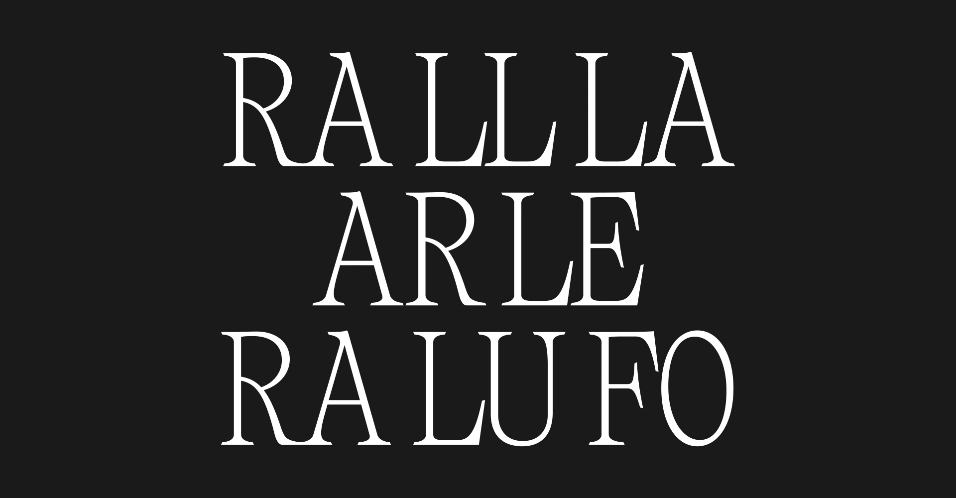
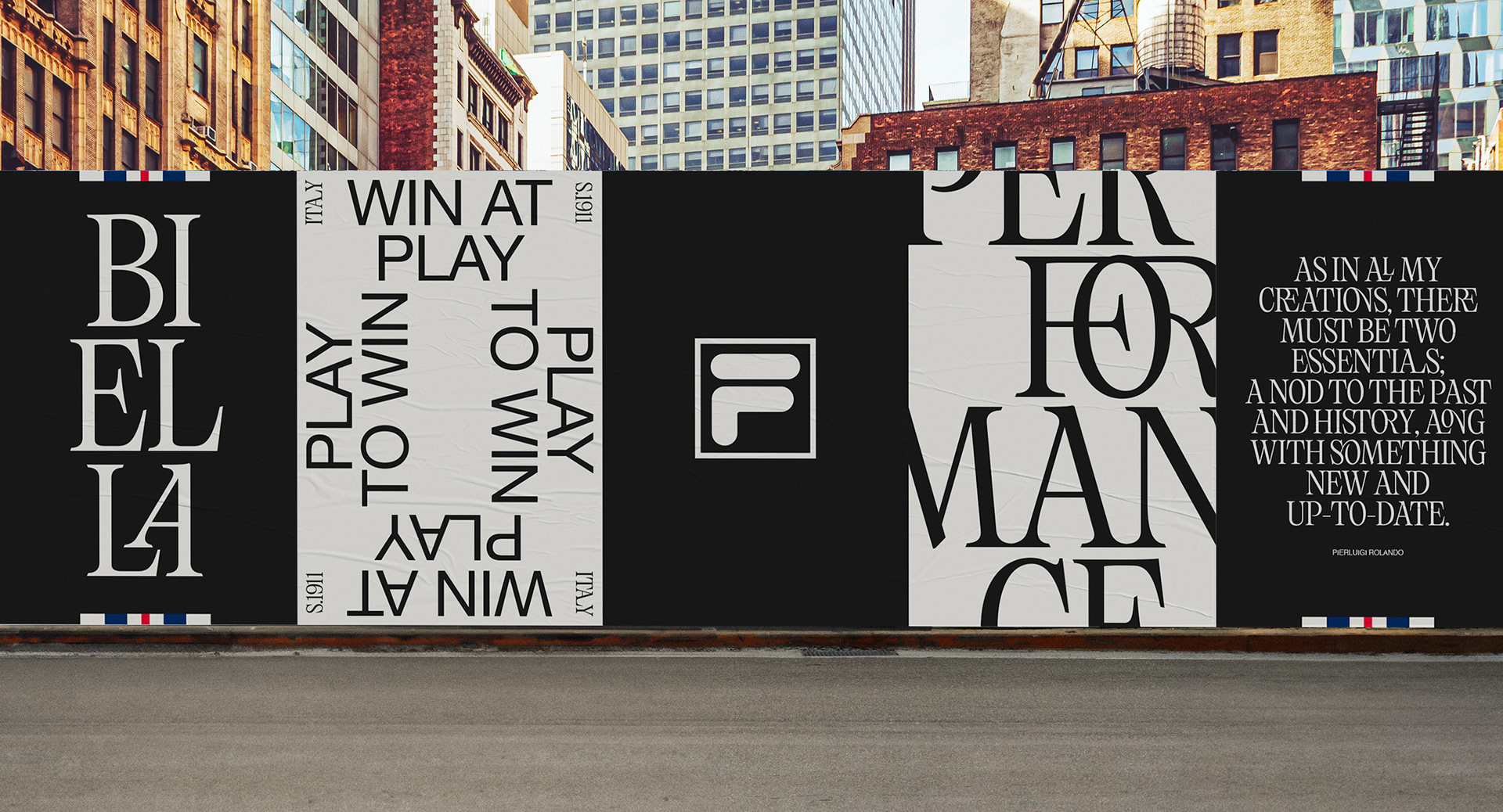
The choice of two distinct typefaces embodies the duality of Heritage and Modernity, creating
a visual language that respects the past while pushing towards the future.
a visual language that respects the past while pushing towards the future.

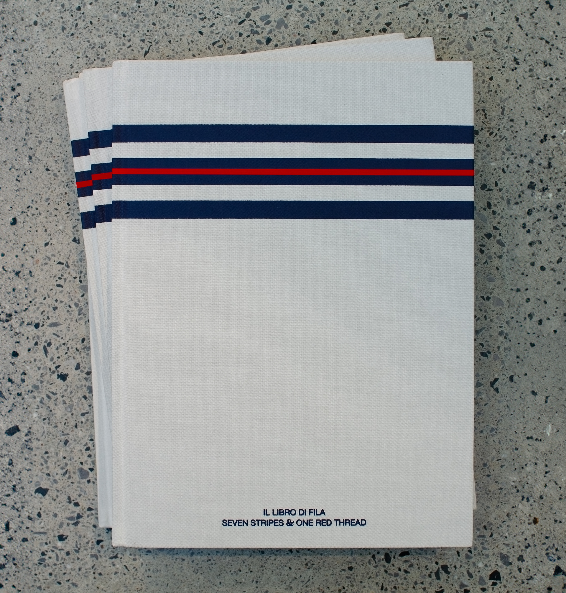
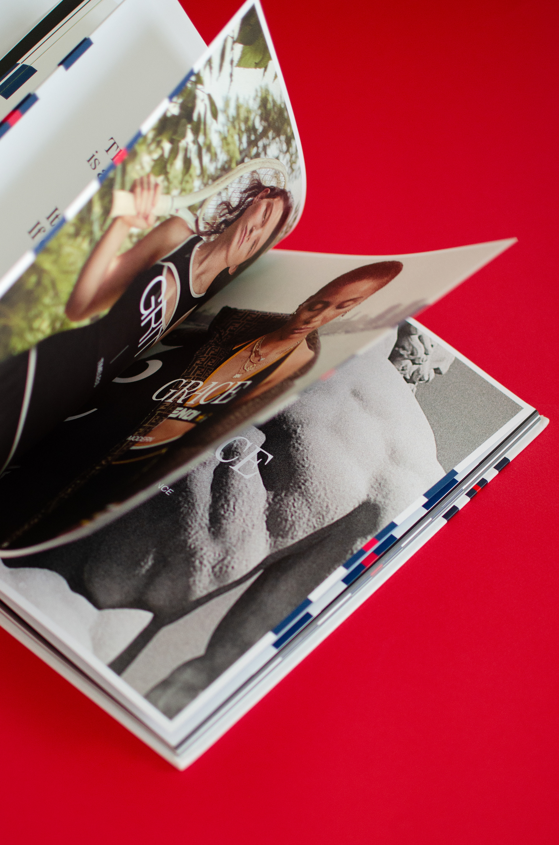
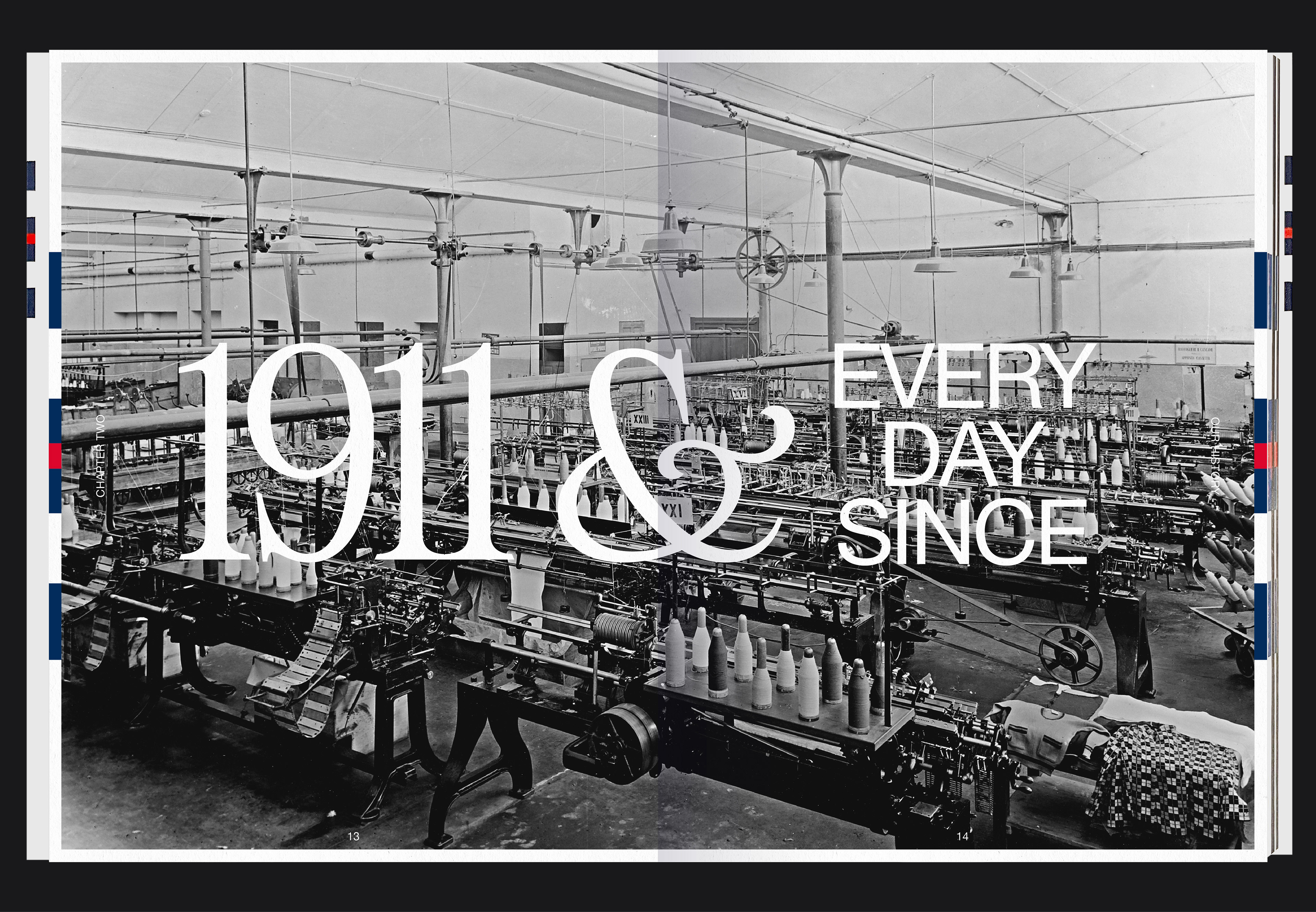
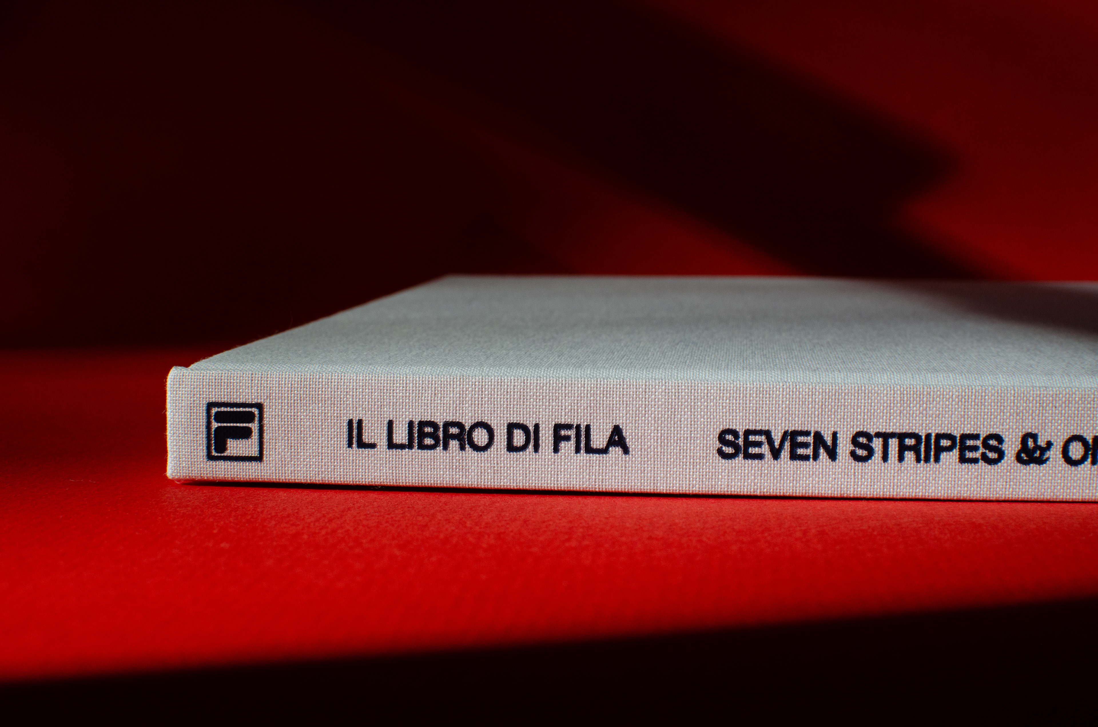
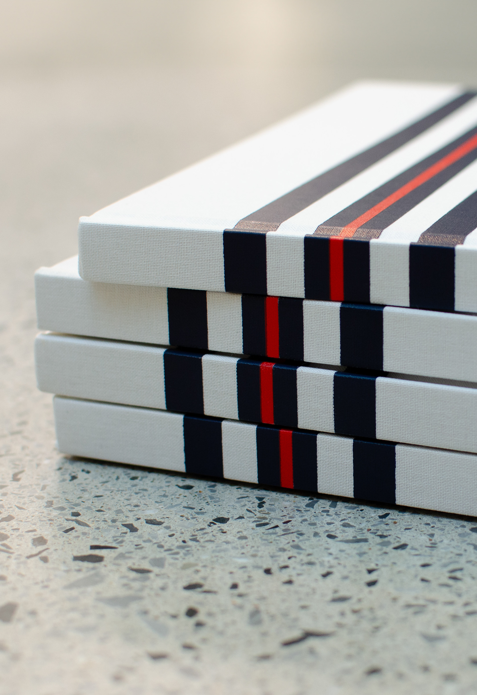
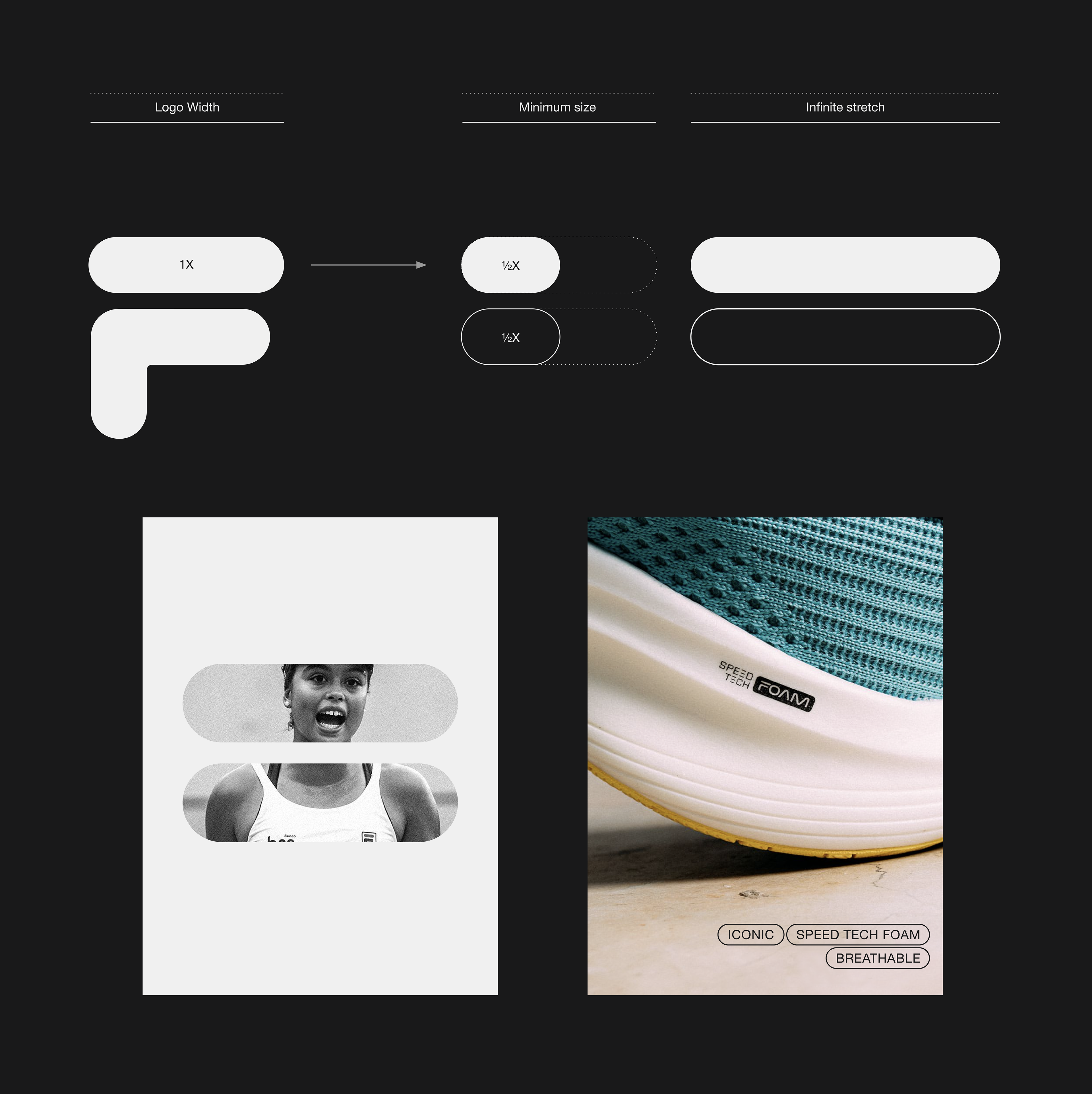
We created a special book that defines the fundamentals and establishes a solid and shared creative foundation. It is a methodical overview of the brand elements, their reason for being and their usage guidelines. It was offered to all the Fila's employees.